Pivot Chart in Excel
A Pivot Chart is a graphical view of the summarized data found in a Pivot Table. A PivotChart and a PivotTable are linked to each other.
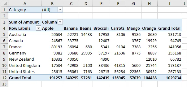
Below you can find a two-dimensional pivot table. Please revisit the Pivot Tables tutorial to understand the steps for creating this pivot table.
💎 Insert Pivot Chart
To create a pivot chart, perform the following steps.
1. Click any cell inside the pivot table.
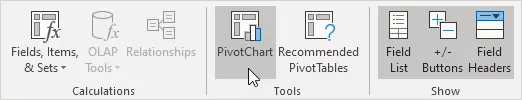
2. Go to the PivotTable Analyze tab, find the Tools group, and click PivotChart.
The Insert Chart dialog box appears.
3. Click OK.
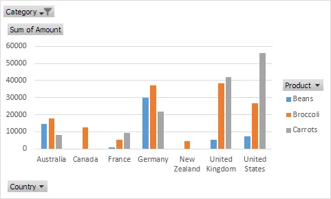
Below you can find the pivot chart. This pivot chart will greatly impress your boss.
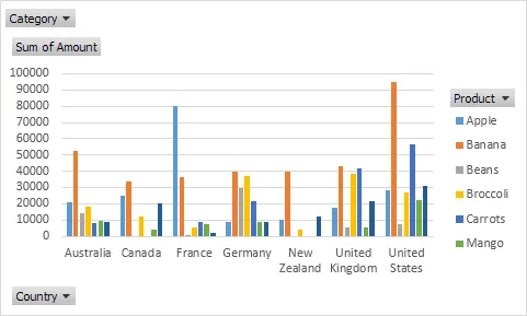
Note: Any change you make in the pivot chart will automatically appear in the pivot table, and any change in the pivot table will appear in the pivot chart.
💎 Filter Pivot Chart
To filter this pivot chart, follow these steps.
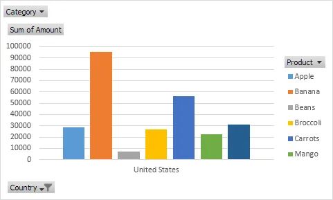
1. Click the small triangles next to Product and Country to use the standard filters. For example, Filter by Country to show only how much of each product is exported to the United States.
2. Remove the Country filter.
3. We added the Category field to Filters, so we can choose specific Categories to show in the pivot chart and table. Apply the Category filter to show only vegetables exported to the respective countries.
💎 Change Pivot Chart Type
You can switch to another type of pivot chart whenever you like.
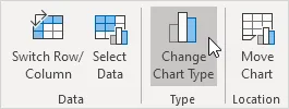
1. Select the chart.
2. Go to the Design tab, find the Type group, and click Change Chart Type.
3. Choose Pie.
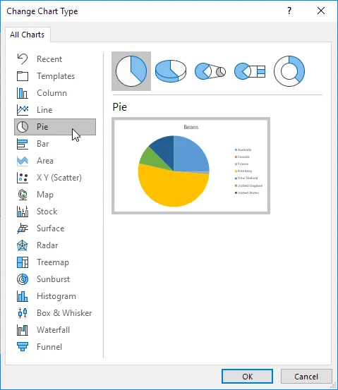
4. Click OK.
Result:
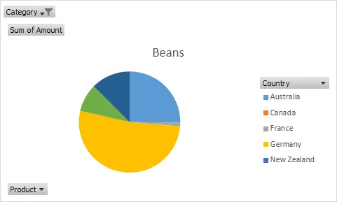
Note: Each pie chart represents a single data series (in this example, Beans). To generate a pivot chart by country, move the data across the axis. First, select the chart. Next, go to the Design tab, find the Data group, and click Switch Row/Column.
5/9 Completed! Learn much more about pivot tables ➝
Next Chapter: Tables