Create Charts in Excel
A simple chart in Excel can convey information more effectively than a spreadsheet full of numbers. Chart creation is a simple process.
Creating a Chart
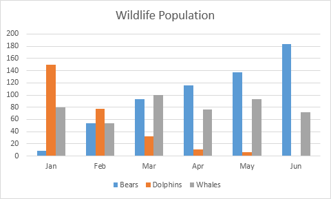
To generate a line chart, follow these steps:
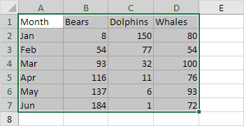
1. Select the range A1:D7.
2. Navigate to the Insert tab, and within the Charts group, click on the Line symbol.
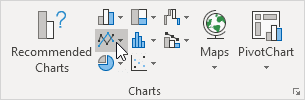
3. Choose Line with Markers.

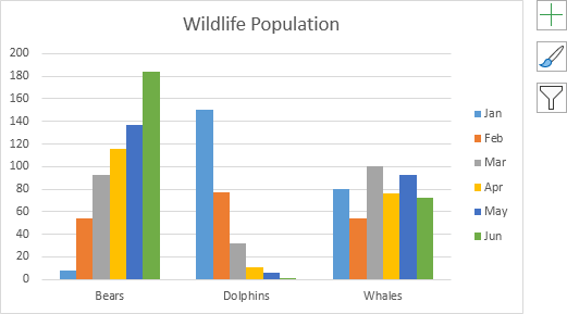
Result: A line chart is created.
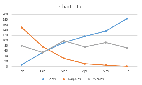
Note: Click on the Chart Title to add a title. For example, name it Wildlife Population.
Changing the Chart Type
Steps to change your chart type:
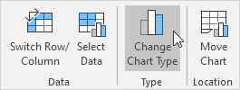
1. Click to select the chart.
2. Go to the Chart Design tab and click Change Chart Type in the Type group.
3. On the left side, select Column.
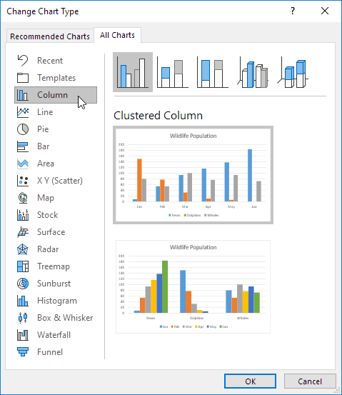
4. Click OK.
Result: The chart type is successfully changed.
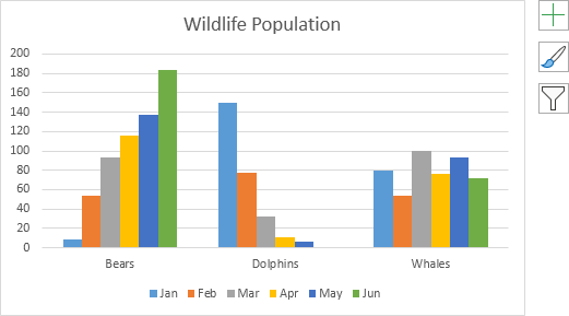
Switching Row/Column Data
To show animals on the horizontal axis instead of months, follow these steps:
1. Select the chart.
2. Go to the Chart Design tab and click Switch Row/Column under the Data group.
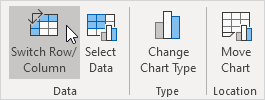
Result: The horizontal axis now shows animal names instead of months.
Adjusting Legend Position
Follow these steps to move the legend to the right of the chart:
1. Select the chart.
2. Click the (+) icon on the right of the chart.
3. Click the arrow next to Legend and choose Right.
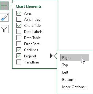
Result: The legend is now positioned on the right.
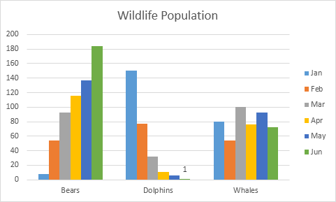
Adding Data Labels
Data labels help highlight specific data points or series, making the chart easier to understand.
1. Click to select the chart.
2. Click the green bar to choose June data.
3. Hold down CTRL and use the arrow keys to select the Dolphin population in June (small green bar).
4. On the right of the chart, click + and enable Data Labels.
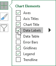
Result: The data labels are now displayed on the chart.
✅ 1/17 Completed! Learn more about charts ➝
Next Chapter: Pivot Tables