Data Analysis in Excel
This section covers Excel’s data analysis features.
1. Sort: You can sort data in Excel to analyze it more clearly. Sort your data by one or more columns, either A to Z or Z to A.
2. Filter: This is mainly used to filter out most of the unwanted data from large data sets and display the data that meets certain criteria.
3. Conditional Formatting: Using conditional formatting, you can highlight cells with a certain colour depending on their value.
4. Charts: Charts are the key data analysis and visualization element. Charts help us to visually analyse and summering data sets, which is a better way to understand data than a sheet full of numbers.
5. Pivot Tables: Pivot Tables are key to effective data analysis in Excel. These are mostly useful for summarizing and analyzing large data sets.
6. Tables: Tables are very useful for handling data and related operations quickly and efficiently.
7. What-If Analysis: This feature helps you explore different scenarios by changing the values of the formula variable.
8. Solver: This Excel Add-In program helps you find the best solution through optimization. The main purpose of this tool is to find the desired outcome by varying the assumptions in the test model.
9. Analysis ToolPak: As the name says, this Excel add-in helps with data analysis in statistics, finance, and engineering.
Enhance your Excel skills! Learn Excel Data Analysis. 🚀 Below is a complete summary of Excel’s data analysis capabilities.
Other Resources:
Data Analysis in Microsoft Excel – Unlock Your Analytical Power in 3 Easy Steps (PDF 2025)
Excel data analysis by examples - PDF Book
1. Sorting in Excel
Custom Sort Order: Custom Sort Order in Excel lets you sort data using a specific order, like sorting tasks by priority levels: High, Normal, Low.
Sort by Color: The “Sort by Color” feature in Excel lets you arrange data based on the fill color of each cell.
Reverse List: This tutorial demonstrates how to reverse the order of a list, such as reversing the list in column A.
Randomize List: Learn how to randomize (shuffle) the order of items in a list using Excel.
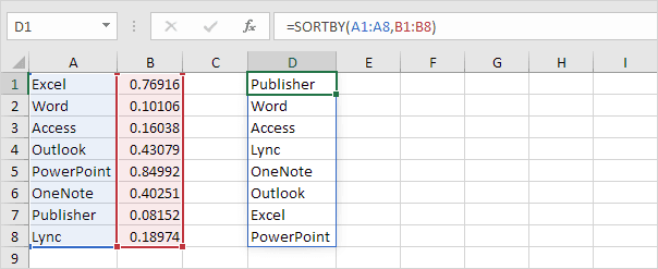
SORT function: The SORT function in Excel 365/2021 helps you sort your data by one or multiple columns. Let’s give it a try.
Sort by Date: Follow this guide to learn how to sort data by date, including converting text-formatted dates to actual dates and using advanced techniques like sorting by month or sorting birthdays.
Alphabetize: Alphabetizing in Excel is easy using the Sort feature, but for custom orders, you may need to set custom lists or use functions like SORT.
2. Filter
Number and Text Filters: Number and Text Filters let you show only records that match certain numeric or text conditions for easier data analysis.
Date Filters: This page explains how to apply date filters to show records based on specific date criteria.
Advanced Filter: The Advanced Filter tool in Excel helps you display only records that meet multiple, more specific conditions, letting you manage and analyze complex data sets effectively.
Data Form: You can use the data form to add, edit, delete, or filter records. This feature is particularly helpful when you want to avoid scrolling left and right in wide rows.
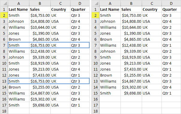
Remove Duplicates: Quickly eliminate duplicate entries using the tool in the Data tab, or use Advanced Filter to remove duplicates without deleting them permanently.
Outlining Data: Organize data for better readability by totaling related rows and collapsing groups of columns.
Subtotal: To avoid counting hidden rows, use SUBTOTAL instead of SUM, COUNT, or MAX in Excel.
Unique Values: The Advanced Filter helps you find and display only unique values within your data set.
FILTER function: Use the FILTER function in Excel 365/2021 to extract data from a dataset based on specific criteria.
3. Conditional Formatting
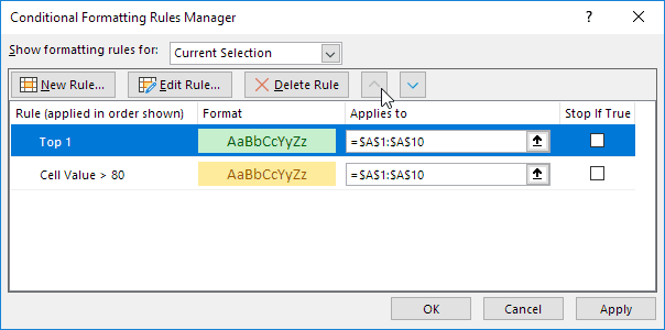
Manage Rules: The Conditional Formatting Rules Manager lists all the formatting rules in the workbook. This tool also lets you create, modify, and remove rules as needed.
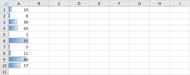
Data Bars: Data bars are a visual tool to show values in a range, with longer bars indicating higher values.
Color Scales: Using color scales, you can visually differentiate values in a range by applying shades of color that represent their magnitude.
Icon Sets: Icon sets enable easy visualization of values within a range by associating specific icons with different value groups.
Find Duplicates: This guide walks you through the process of identifying duplicate (or triplicate) values and entire duplicate rows in Excel.
Shade Alternate Rows: Learn how to use conditional formatting to apply shading to alternate rows, improving data readability.
Compare Two Lists: Learn how to compare two lists in Excel by applying conditional formatting and using the COUNTIF function to highlight differences.
Conflicting Rules: When multiple conditional formatting rules overlap in Excel, the rule with the highest precedence takes effect. This example showcases different outcomes.
Heat Map: A heat map in Excel is a graphical representation where colors are used to indicate value variations within a dataset. You can create it quickly with conditional formatting.
4. Charts
Column Chart: A column chart visually compares values across different categories using vertical bars. Follow these steps to create one.
Line Chart: A line chart shows changes over time by linking data points with a continuous line, highlighting trends clearly. Use it for text labels, dates, or when there are a few numbers on the horizontal axis.
Pie Chart: A pie chart displays parts of a whole as slices of a circle, helping to easily compare the proportion of each category within one data set.
Bar Chart: A bar chart is the horizontal equivalent of a column chart and is useful for displaying categories with longer text labels.
Area Chart: An area chart shows data trends over time by coloring the space below a line graph.
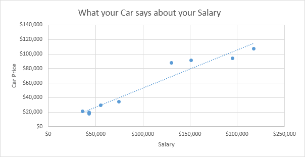
Scatter Plot: Also known as an XY chart, a scatter plot is used to display relationships between two numerical variables, often in scientific or statistical analysis.
Data Series: A data series is a set of related numbers in a chart, usually from a row or column, and a chart can display multiple data series.
Axes: Charts use two axes: horizontal (x) and vertical (y) for data. This guide explains how to modify axis types, add axis titles, and adjust the vertical axis scale.
Trendline: A trendline in Excel helps you visualize trends by adding a line to your chart, aiding in better data analysis.
Error Bars: Quickly incorporate error bars into your charts, along with instructions on adding custom error bars for precise data representation.
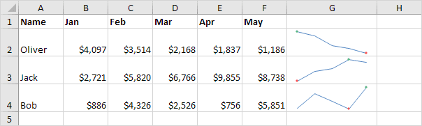
Sparklines: Sparklines are tiny charts within cells that highlight trends. Excel offers three types: Line, Column, and Win/Loss.
Combination Chart: A combination chart shows different types of charts together in one, allowing easy comparison of multiple data sets in a single view.
Gauge Chart: A gauge chart combines a doughnut and a pie chart to visually display progress or performance.
Thermometer Chart: Learn how to create a thermometer chart that displays the progress toward a goal.
Gantt Chart: Excel doesn’t have a built-in Gantt chart, but you can make one by modifying a stacked bar chart.
Pareto Chart: A Pareto chart integrates a column chart and a line graph, demonstrating that approximately 80% of outcomes stem from 20% of causes, as per the Pareto principle.
5. Pivot Tables
Group Pivot Table Items: Learn how to group pivot table elements, including grouping products or organizing dates into quarters.
Multi-level Pivot Table: Pivot tables allow for multiple row fields, value fields, and report filter fields, creating a structured multi-level data summary.
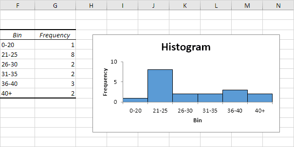
Frequency Distribution: Pivot tables can efficiently generate frequency distributions. The Analysis ToolPak add-in in Excel lets you create histograms quickly and easily.
Pivot Chart: A pivot chart visually represents a pivot table’s data, maintaining a direct link to the underlying table.
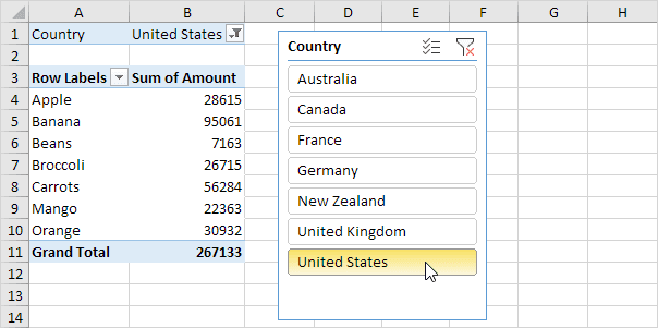
Slicers: Use slicers to quickly filter data in a PivotTable. You can even connect multiple slicers across several pivot tables for enhanced reporting.
Update Pivot Table: Since pivot tables do not automatically refresh when the dataset changes, you need to update them manually by refreshing or modifying the data source.
Calculated Field/Item: This tutorial walks you through adding a calculated field or item within a pivot table.
GetPivotData: GETPIVOTDATA extracts specific information directly from a pivot table based on your chosen criteria. To use it, type = and select a cell in the pivot table.
6. Tables
Structured References: Instead of standard cell references, structured references make formulas easier to interpret when working with Excel tables.
Table Styles: Quickly format a data range by selecting a predefined table style or creating a custom design.
Merge Tables: Use tables alongside the VLOOKUP function to merge two tables efficiently, taking your Excel skills to the next level.

Table as Source Data: Excel tables can serve as source data for pivot tables, charts, and other analytical tools.
Remove Table Formatting: This guide explains two methods for removing table formatting—one for Excel tables and another for manually formatted data ranges.
Quick Analysis: The Quick Analysis tool helps you quickly format, calculate, and create tables for better understanding and analysis of your data.
7. What-If Analysis
Data Tables: Data tables let you quickly test many input values in formulas, showing results for multiple scenarios without creating each one manually. It’s possible to make a table with one or two variables.
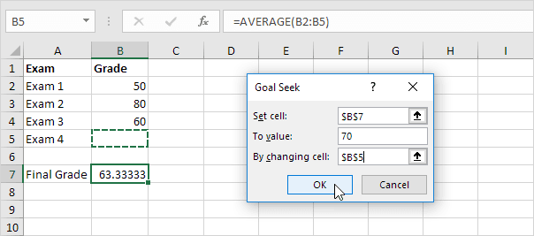
Goal Seek: Goal Seek helps you find the input needed in a formula to get the exact result you want.
Quadratic Equation: A quadratic equation follows the form ax² + bx + c = 0 (where a ≠ 0). Use the quadratic formula or Excel’s Goal Seek tool to find accurate solutions for quadratic equations quickly and easily.
8. Solver
Transportation Problem: Solver helps determine the optimal number of units to transport from factories to customers while minimizing costs.
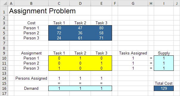
Assignment Problem: The Assignment Problem involves allocating tasks to individuals to either minimize total cost or maximize overall efficiency in completing the tasks.
Shortest Path Problem: The Solver identifies the shortest route between two nodes within a network. Nodes are points (like S, A, B, and C), and arcs are the links between them, like SA, SB, or AC.
Maximum Flow Problem: Use Solver to determine the highest possible flow between nodes within a directed network.
Capital Investment: Solver helps identify the best combination of capital investments to maximize profits.
Sensitivity Analysis: This analysis evaluates how changes in model coefficients impact the optimal solution. After finding a solution, Solver lets you create a report to analyze the changes and impacts.
System of Linear Equations: This guide demonstrates how to solve a system of linear equations using Excel.
9. Analysis ToolPak
Histogram: A histogram in Excel is created using the Analysis ToolPak to visualize data distribution effectively.
Descriptive Statistics: Generate descriptive statistics using the Analysis ToolPak add-in, such as summarizing test scores for multiple participants.
ANOVA test in Excel: This guide walks you through performing a one-way ANOVA (Analysis of Variance) to compare means across multiple groups.
F-Test: Conduct an F-test in Excel to determine whether the variances of two populations are statistically equal.
t-Test: Perform a t-test in Excel to compare the means of two different populations.
Moving Average: Calculate a moving average to reduce fluctuations in a time series and highlight trends.
Exponential Smoothing: This method highlights trends by smoothing out short-term changes.
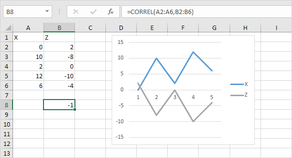
Correlation: Use the CORREL function or the Analysis ToolPak to find the correlation between two datasets.
Regression: Learn how to perform a linear regression analysis and interpret the results in Excel.
Check out our next section: Excel VBA.